Abracadabra Money
Client: Abracadabra Money
Year: 2021-2023
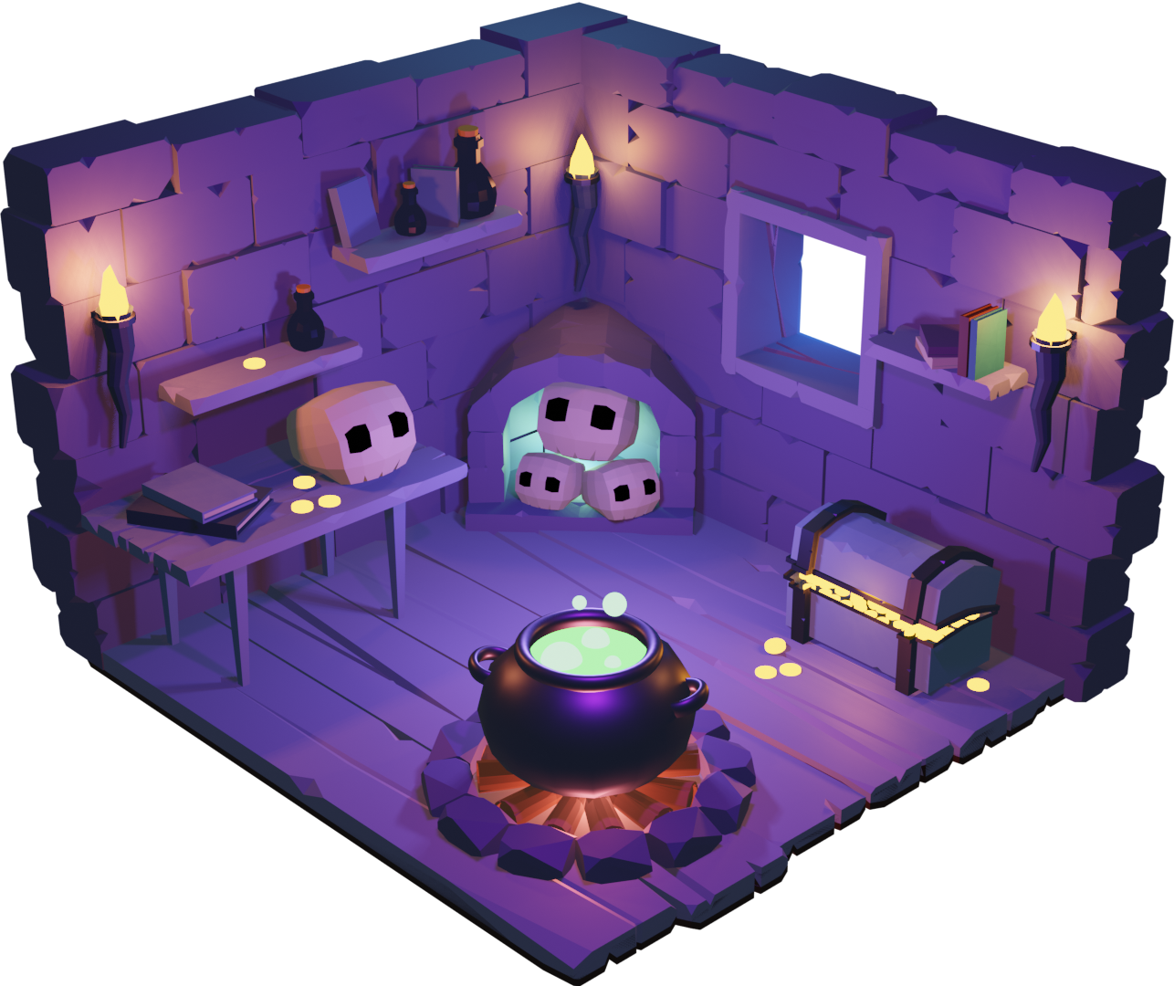
Service: Art direction, visual concept, illustration, animation, logo design, 3D elements.
Abracadabra.money is an Omnichain DeFi lending platform that works its magic by utilizing interest-bearing tokens as collateral to mint Magic Internet Money (MIM), a USD-denominated stablecoin.
Project Scope & Contribution: The project underwent two stages of redesign to align with the platform’s evolving identity and market presence. My role encompassed:
✔ Art Direction & Visual Concept: Developing a unique, engaging aesthetic that enhances brand recognition.
✔ Illustration & Animation: Crafting high-quality visuals to reinforce the platform’s identity and storytelling.
✔ 3D Design Elements: Designing stylized, interactive assets that bring a sense of magic and innovation to the brand.
✔ Logo Redesign: Refining and modernizing the logotype to fit the platform’s futuristic vision.
Result:The redesign strengthened Abracadabra Money's brand presence within the DeFi space, creating an immersive and recognizable identity that reflects the innovative nature of the platform.
Logo
The first redesign aimed to retain the magical, mysterious essence of Abracadabra Money. The glowing crystal symbolizes a force unlocking new possibilities, reflecting the idea of digital financial alchemy—turning complex crypto mechanisms into something accessible. Smooth lines add modernity, while light and shadow enhance the mystical aesthetic, making the logo both recognizable and unique.
Color Palette
The palette transitions from gamification to a structured, professional look while keeping a magical touch. A deep background (HEX 221B47) adds mystery, purple shades (HEX 7B79F7, 9695FB) bring a futuristic feel, and light blue (HEX 75C9EE) conveys transparency and trust. Gradients (HEX 5282FD, A173EF, 6F4CF4) highlight dynamism, with white text (HEX FFFFFF) ensuring clarity.
Landing Page Animation
To balance gamification with a more serious tone, I developed this landing animation. It merges fantasy and finance, illustrating the alchemy of digital transactions through a whimsical yet structured system. The flowing coins, glowing orbs, and animated machine create an engaging visual narrative, making complex financial concepts more intuitive and immersive.